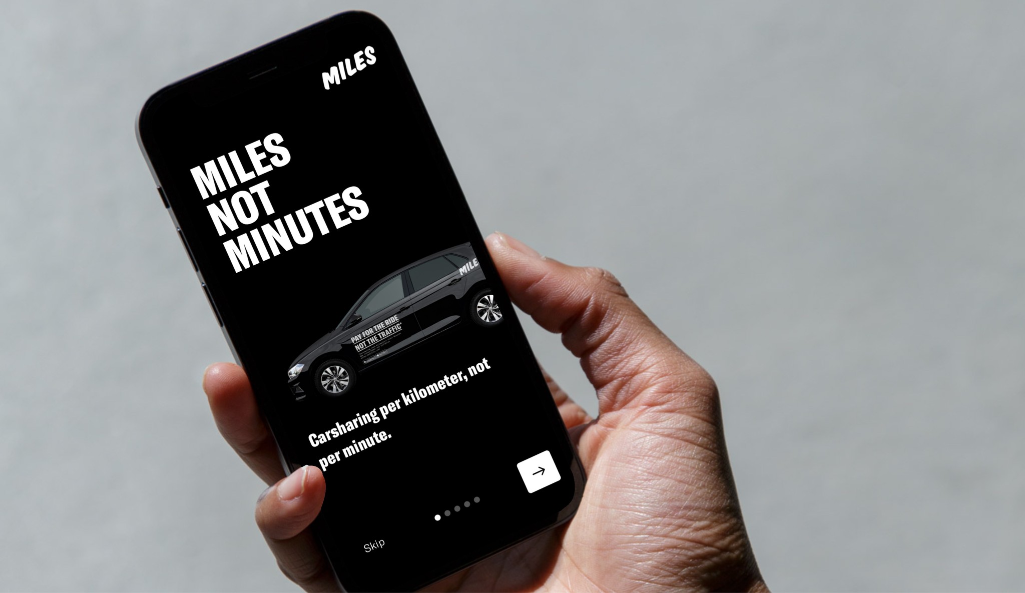
MILES Mobility App & Web
During my time as a UX/UI Designer at MILES Mobility, I played a key role in refining and improving the user experience across various digital platforms, including the iOS app and web products. My contributions focused on establishing a cohesive design system, optimizing user engagement, and expanding the company's product offerings. By adopting a user-centric approach and collaborating cross-functionally, I helped to streamline design processes, ensuring consistency and innovation throughout the MILES brand ecosystem.
01
Problem Statement
MILES Mobility, a growing player in the car-sharing industry, faced challenges in maintaining a consistent and engaging user experience across its digital platforms. Users needed intuitive, user-friendly interfaces that facilitated seamless interactions. However, inconsistencies in design and a lack of standardized visual guidelines were leading to fragmented experiences, which risked reducing user satisfaction and engagement. Addressing these issues was critical to support MILES Mobility's goal of delivering a unified, high-quality user experience that catered to its growing customer base.
02
Objective
The main goal of my work at MILES Mobility was to enhance usability and user engagement across all digital touchpoints, including the iOS app and web products. By establishing a cohesive design system, I aimed to ensure visual consistency, streamline design processes, and support the development of intuitive, user-friendly interfaces. My focus was on delivering a seamless user experience that not only met but exceeded user expectations, ultimately driving increased interaction and satisfaction with MILES Mobility's services.
03
Research Methodology
To ensure that the design initiatives at MILES Mobility were user-centric and aligned with business goals, a comprehensive research methodology was adopted. This approach incorporated various qualitative and quantitative methods to gain deep insights into user needs, preferences, and pain points. The following methods were integral to shaping the design and enhancing the user experience across MILES' digital platforms:
Baseline UX/UI Analysis: The initial phase involved a thorough analysis of the existing UX, UI, and content across MILES' iOS app and web offerings. This assessment helped identify inconsistencies, usability issues, and areas for improvement. By evaluating the current state of the digital touchpoints, key areas that required redesign or optimization could be prioritized.
User Interviews: Conducting interviews with both existing and potential users provided qualitative insights into user behavior, preferences, and challenges. These conversations helped uncover users’ motivations for choosing MILES' services, their expectations from the app and website, and specific pain points they experienced during interactions. Insights gathered from these interviews guided the development of user-centric features and design elements.
Surveys: Online surveys were distributed to a broader audience to gather quantitative data on user satisfaction, feature preferences, and overall experience with MILES Mobility’s digital offerings. The survey responses helped validate findings from the interviews and status quo analysis, ensuring that the feedback represented a wide range of user perspectives.
Competitor Analysis: An in-depth competitor analysis was conducted to benchmark MILES Mobility against other leading car-sharing services. This analysis focused on identifying best practices in UX/UI design, user engagement strategies, and feature offerings. Understanding how competitors addressed similar challenges provided valuable insights for optimizing MILES' user experience and differentiating its digital products.
"How Might We" Questions: To foster creative problem-solving, the “How Might We” approach was employed during the research. The open-ended questions encouraged brainstorming and exploration of innovative solutions to specific user challenges. For example, questions like "How might we simplify the registration process?“ or "How might we enhance user engagement post-ride?“ led to targeted design improvements.
Empathy Mapping: Empathy mappings were held to visualize users’ emotions, thoughts, and behaviors during interactions with MILES Mobility’s platforms. This method helped empathize with the users, identifying their primary concerns and desires. By capturing users’ emotional experiences, interfaces that resonated with users on a personal level could be designed.
Customer Journey Mapping: To gain a holistic understanding of the user experience, customer journey mapping was employed. This method involved outlining the entire user journey, from initial awareness of MILES Mobility to post-ride experiences. By identifying key touchpoints, pain points, and moments of delight throughout the journey, solutions could be designed that addressed users’ needs at every stage. This approach ensured that all aspects of the user experience were considered, leading to more cohesive and satisfying interactions across the platform.
A/B Testing: To validate design changes and optimize user engagement, A/B testing was implemented. Different versions of app screens, web pages, or features were tested with real users to evaluate which designs led to higher user satisfaction and interaction rates. This data-driven approach ensured that design decisions were based on actual user behavior and preferences, resulting in more effective and appealing user interfaces.
04
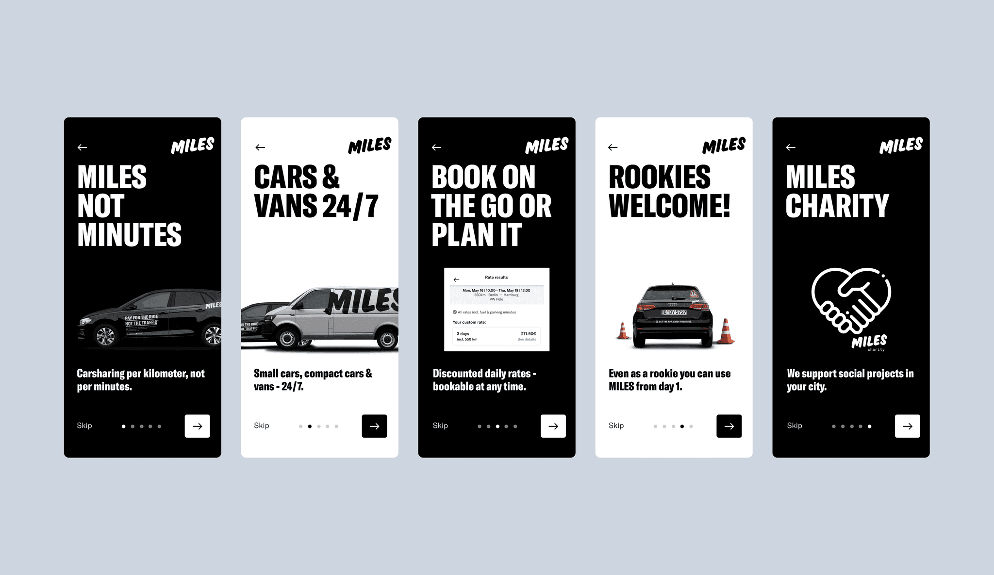
Onboarding for MILES App
To improve the initial interaction and engagement of new users, the onboarding screens of the MILES app were periodically enhanced. These updates were focused on communicating MILES' unique car-sharing benefits clearly and effectively. By emphasizing key selling points, such as flexible booking options, vehicle variety, and inclusivity for new drivers, the onboarding experience was designed to be informative yet concise. The visual design approach maintained a clean, modern and bold aesthetic, ensuring that the messaging was both engaging and easy to understand, setting a positive first impression and aligning with MILES' brand identity.
05
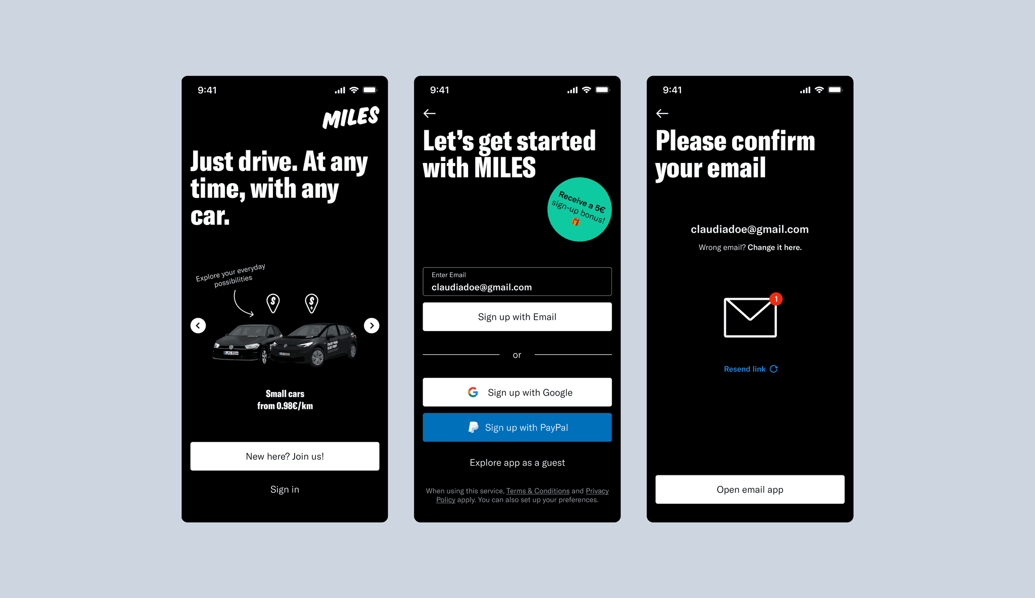
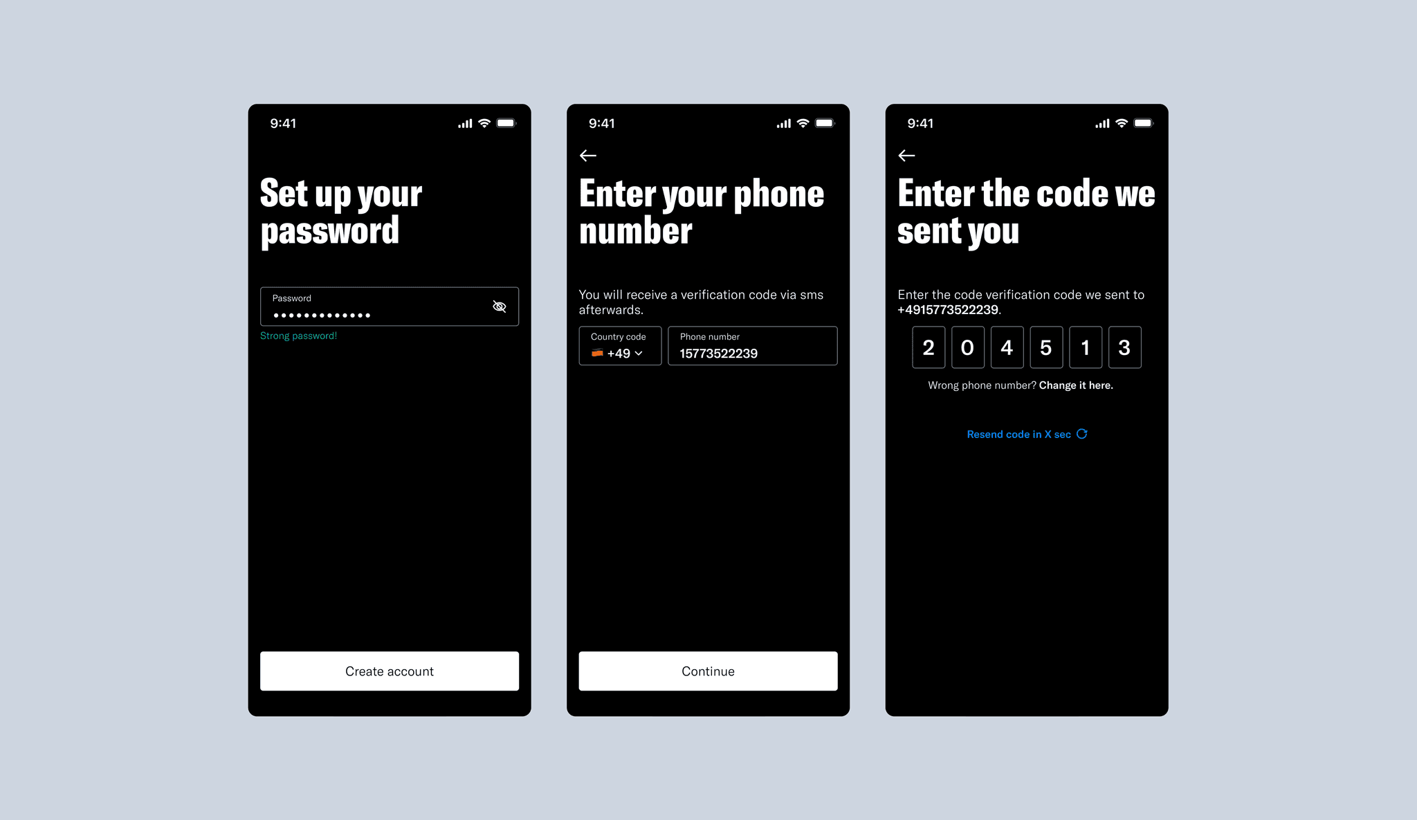
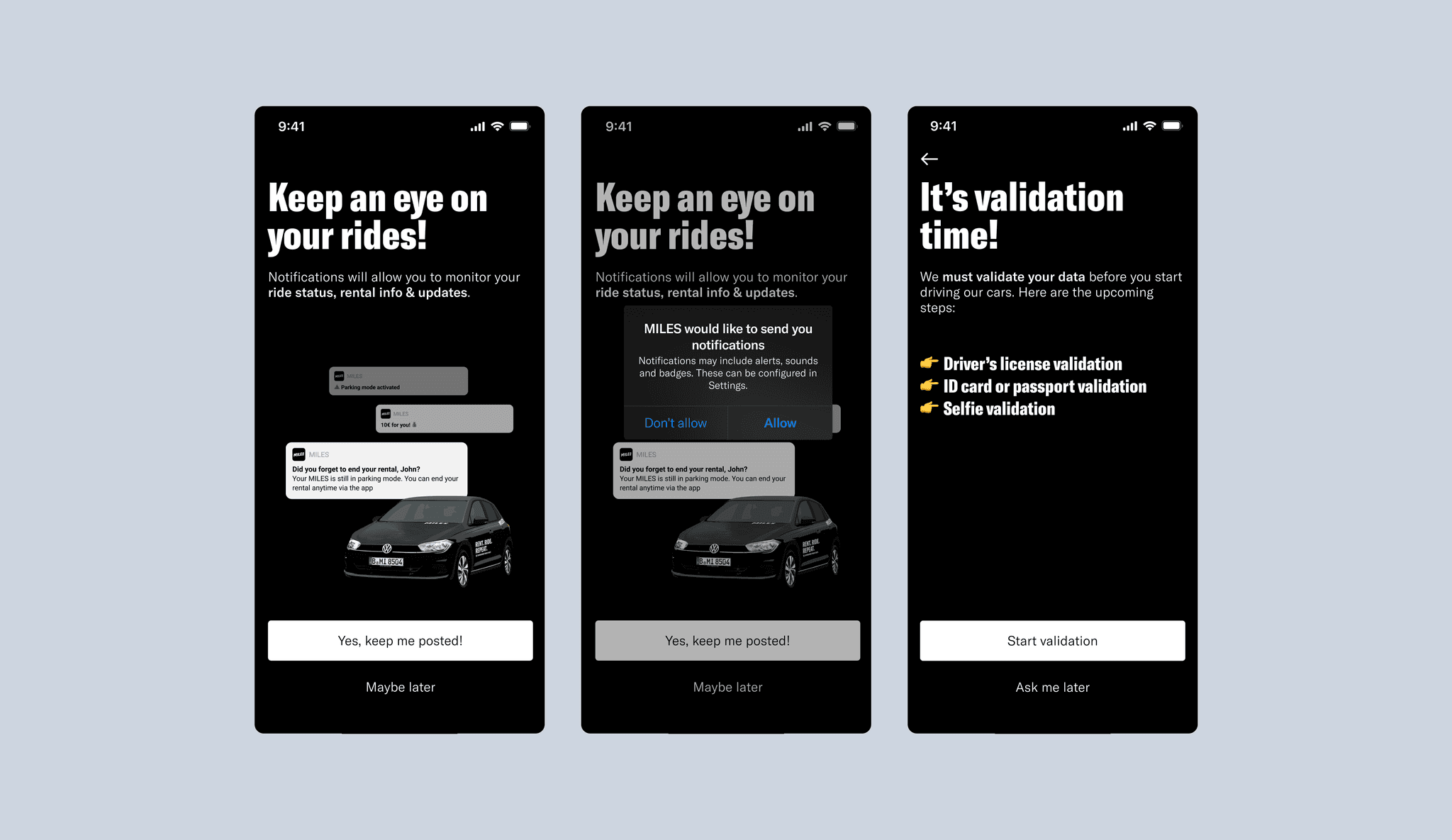
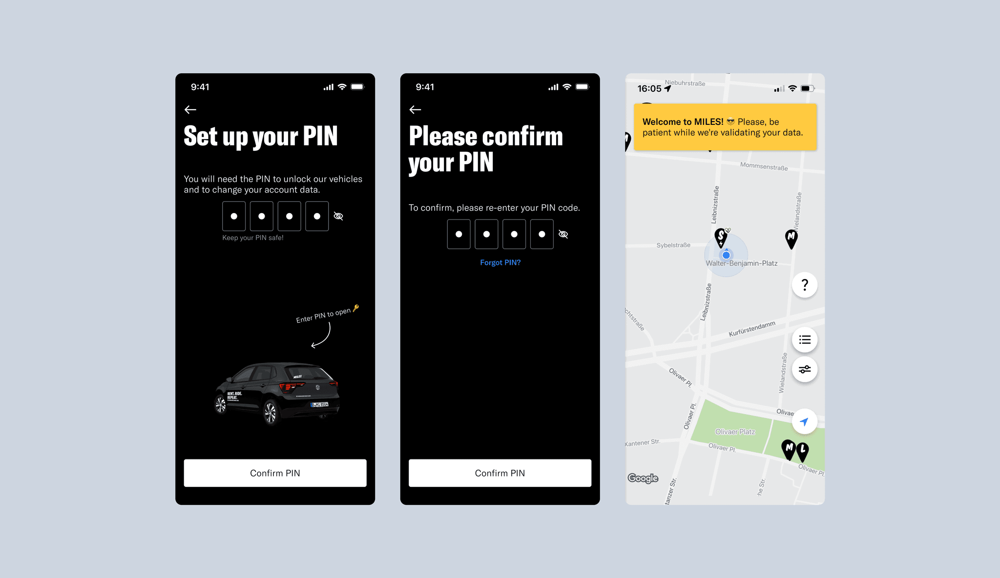
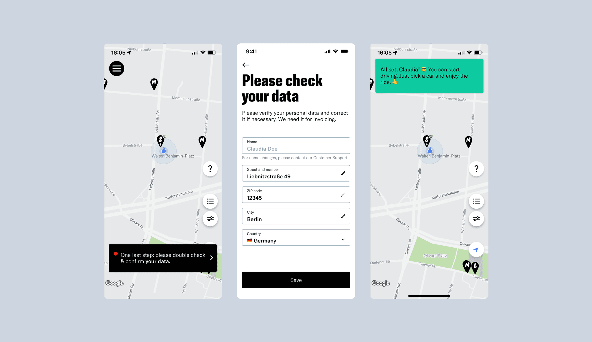
Optimized Registration Flow for MILES App
The task of updating the registration flow for the MILES app was guided by the need to streamline the onboarding process, reduce user drop-offs, and improve overall user satisfaction. The original registration process was lengthy, comprising many steps that required significant time and effort from users. This often led to frustration and a high likelihood of users abandoning the process. The goal was to create a more intuitive, engaging, and efficient registration experience that would increase the conversion rate and provide a positive first impression of the MILES service.
To address these challenges, a comprehensive analysis was conducted, evaluating the current user flow, identifying pain points, and benchmarking best practices from successful sign-up processes across various industries. Usability testing sessions provided insights into user behavior and preferences, revealing areas where the registration flow could be simplified and made more user-friendly. Additional feedback was gathered through surveys and interviews to understand what features and options users found most beneficial during sign-up.
06
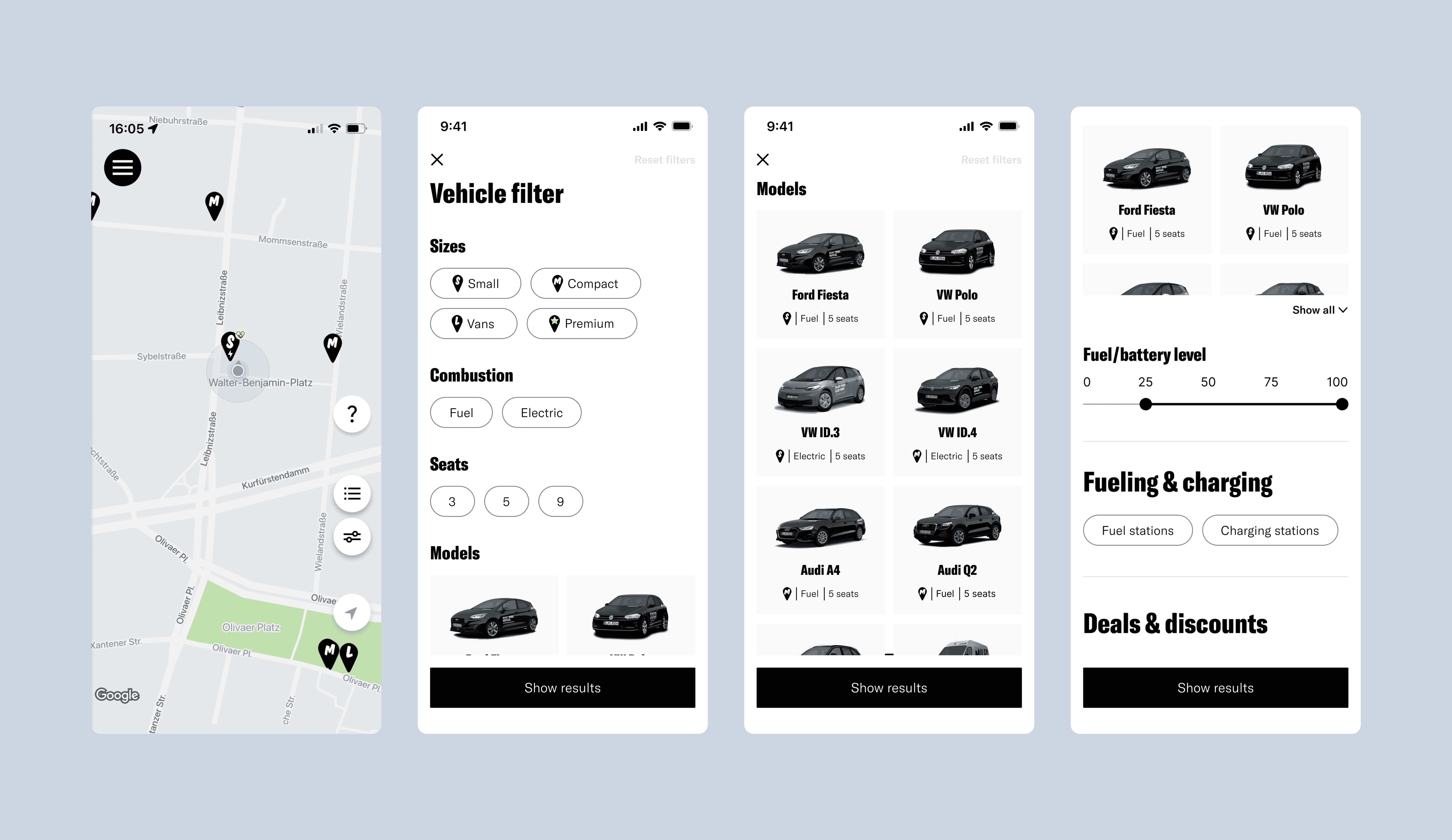
Enhanced Filter for MILES App
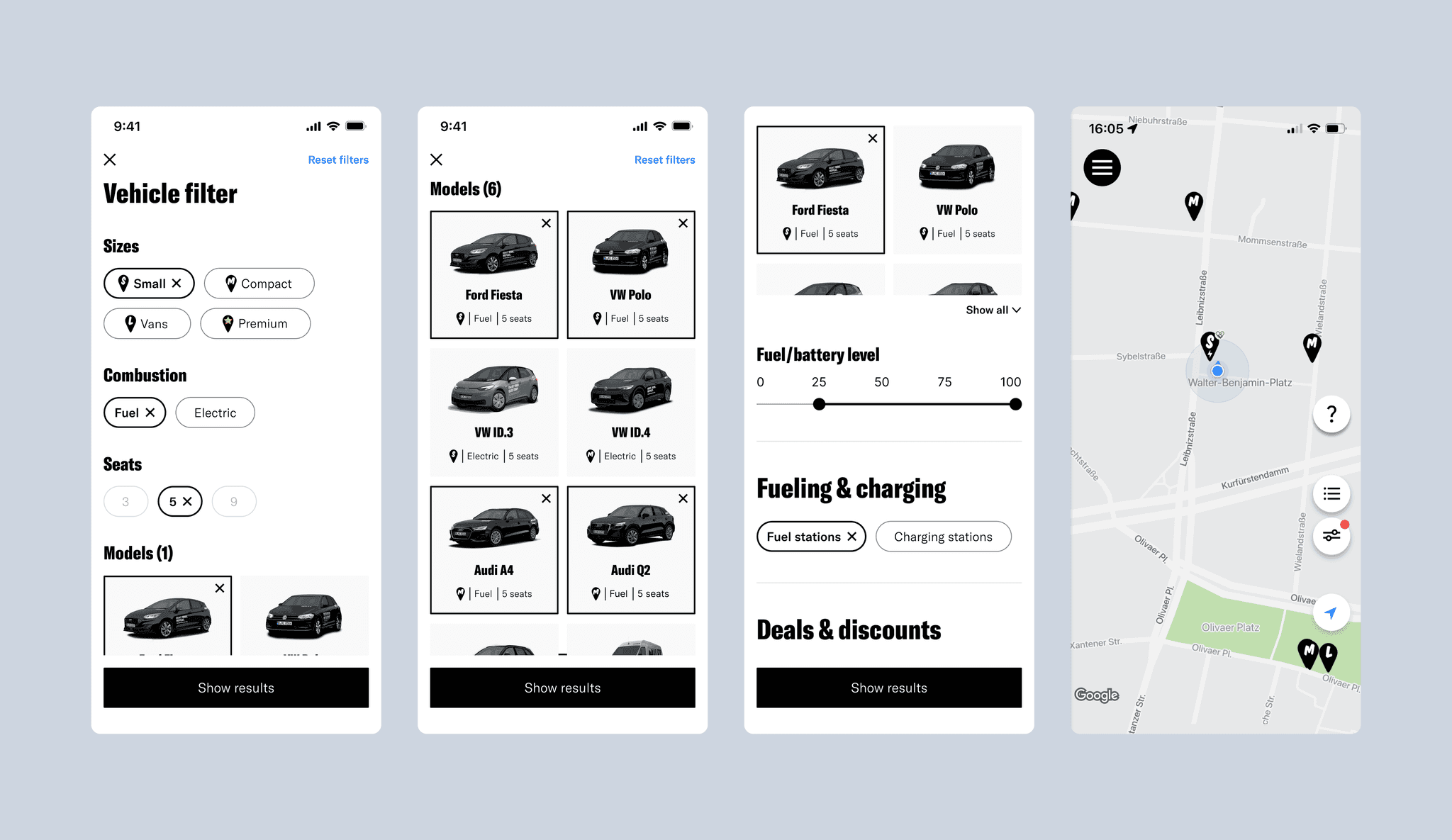
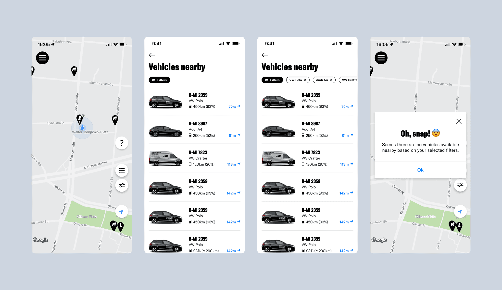
The task of updating the filter functionality within the MILES app was driven by the need to accommodate an expanding fleet of diverse vehicles and improve the overall user experience. With more vehicle types being added, such as 9-seater vans, convertibles, and flatbed trucks, the existing filter system was becoming insufficient and cumbersome. The objective was to create a more intuitive, user-friendly filter interface that would increase the conversion rate by making it easier for users to find and select their desired vehicle.
A comprehensive competitive analysis was conducted, examining filtering approaches used by direct car-sharing competitors, car rental services, and popular booking platforms. Insights from this research informed the development of various filter options, exploring parameters like vehicle brand, type, and features. Different UI flows were tested to determine the most efficient navigation and filter application methods, considering aspects such as whether to use an "Apply Filter" button or have changes auto-update upon selection.
The final solution involved several key updates:
Streamlined Navigation: Navigation was simplified to reduce the number of clicks required to apply or reset filters, enhancing the overall usability.
Consistent Visual Design: Filter icons and typography were standardized for a cohesive and professional look. A new, clearer filter icon was introduced.
User-Centric Structure: The filter options were reorganized based on real customer needs, making it easier for users to find relevant vehicles without being overwhelmed by choices.
Visual Vehicle Representation: Vehicles were visualized within the filter interface, providing users with a clear understanding of the options available to them.
Complexity Reduction: While introducing more detailed filtering options, complexity was minimized to ensure that the user interface remained approachable and straightforward.
By focusing on user needs and adopting best practices from industry leaders, the updated filter system in the MILES app not only improved usability but also enhanced user satisfaction and engagement, ultimately driving higher conversion rates and a more enjoyable car-sharing experience.
07
Rate Picker Update for MILES App
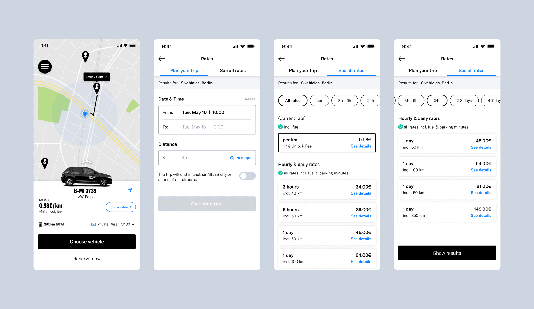
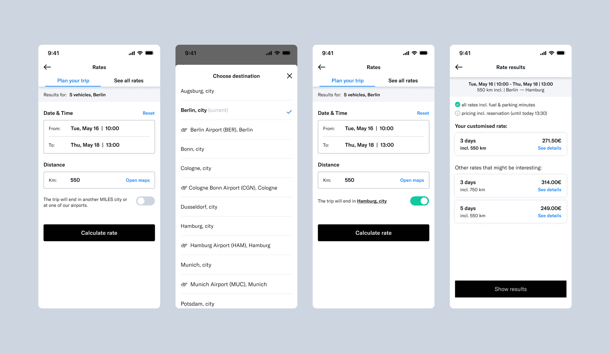
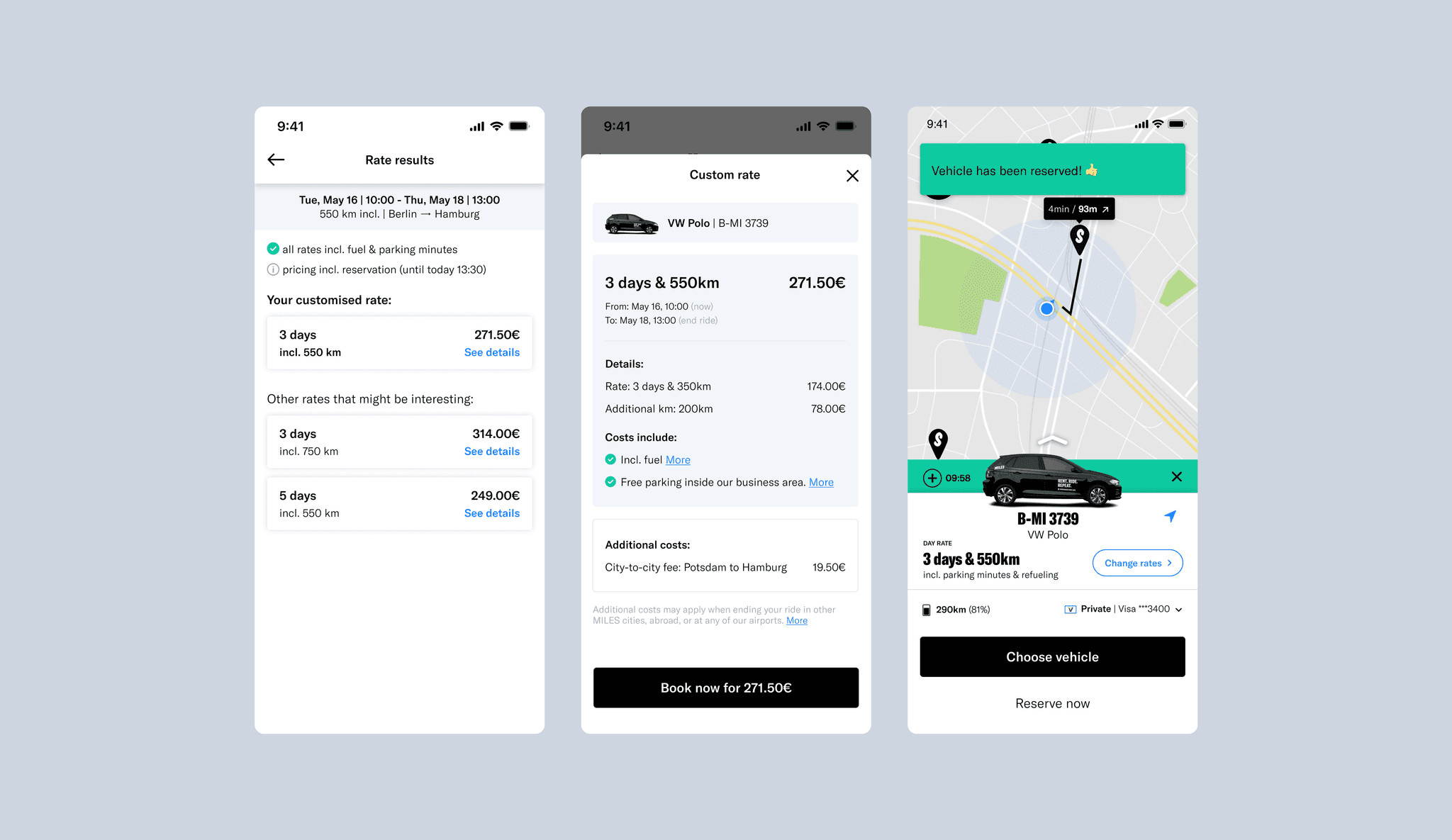
Updating the rate picker in the MILES app was motivated by the goal of increasing transparency and enhancing the user experience. The existing rate picker was overly simplistic, offering only hardcoded rate options without adequate information on costs, potential surcharges, or the consequences of exceeding set limits. This lack of clarity led to user confusion, dissatisfaction, and increased support inquiries, making it crucial to redesign the feature to better meet user needs and expectations.
A thorough research process was undertaken, examining how direct car-sharing competitors, car rental services, and popular booking platforms such as Airbnb handle rate selection and pricing transparency. The goal was to identify best practices that could be adapted to provide a more user-centric and intuitive rate selection experience. Key focus areas included how to clearly present rate information, manage trip planning with flexible durations and distances, and provide users with options to adjust rates during a ride.
The final solution involved several key updates:
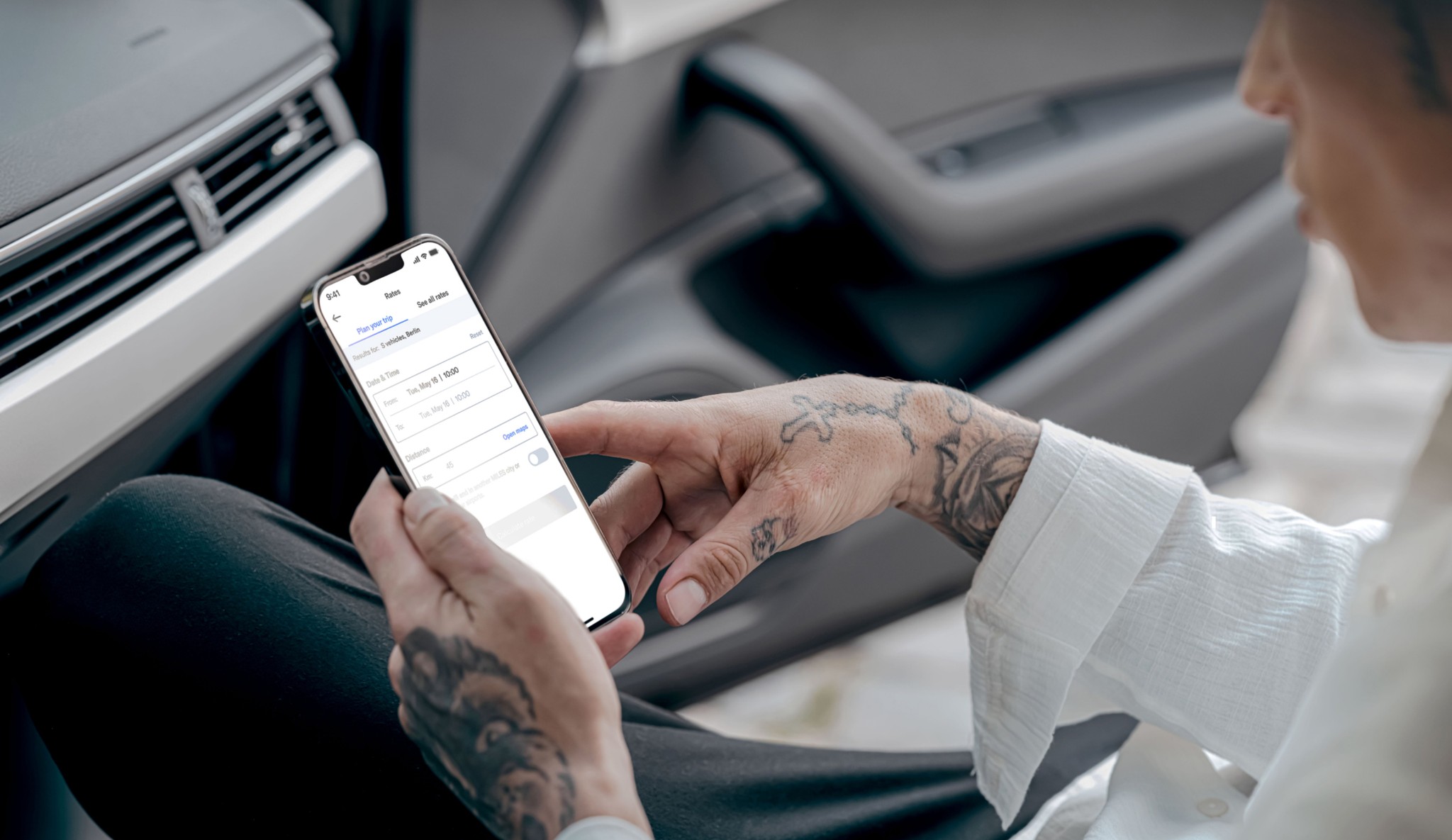
Dynamic Trip Planning: A new trip planning feature was introduced, allowing users to easily plan their trips by selecting the desired duration and distance. The system automatically calculates and presents the best-customized rates, helping users optimize costs based on their specific needs.
Transparent Pricing Information: To improve transparency, detailed pricing breakdowns were provided. This included base rate prices, additional charges for exceeding kilometers or time limits, and any extra fees for special services like city-to-city travel or airport pickups. Users could now see exactly what was included in each rate and what additional costs might apply, making it easier to make informed decisions.
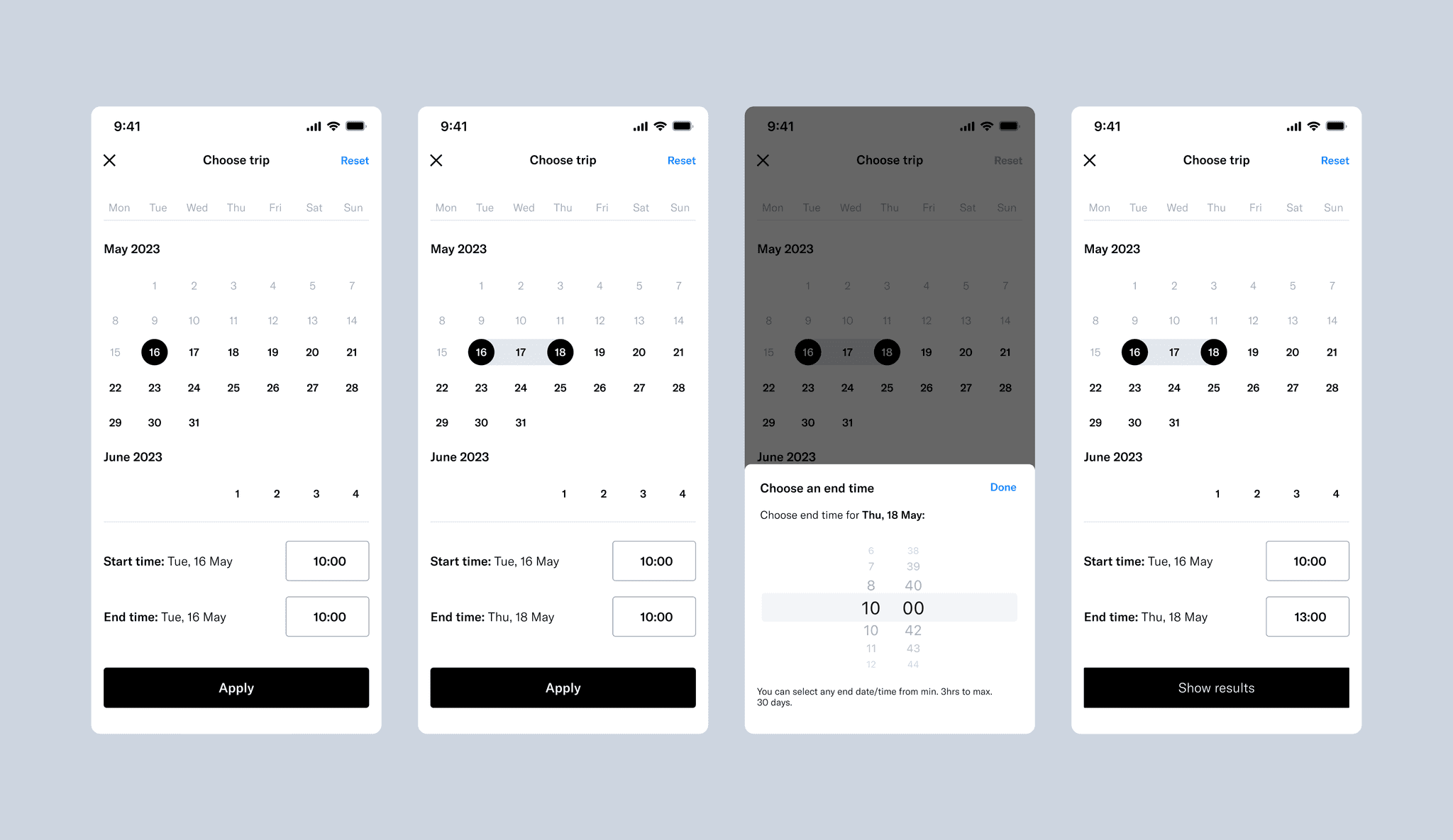
Flexible Booking Options: The rate picker now allows users to select end dates and times for their trips, offering flexibility ranging from a minimum of 3 hours to a maximum of 30 days. This feature caters to both short-term and long-term planning needs, providing greater convenience and control over trip planning.
Enhanced User Interface: The UI was redesigned to be more intuitive and visually appealing. Consistent typography, well-organized content blocks, and simplified navigation improved the overall user experience, making it easier for users to find and select the appropriate rate options without feeling overwhelmed.
User-Centric Design: The new design ensures that users can effortlessly navigate through different rate options, understand the details and implications of each choice, and adjust their selections if needed. This approach not only enhances usability but also encourages more users to pre-select rates, thereby increasing customer satisfaction and reducing the number of support inquiries.
08
End-Ride Rating Improvement for MILES App
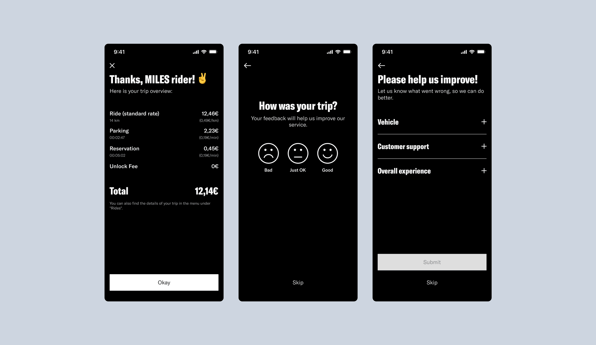
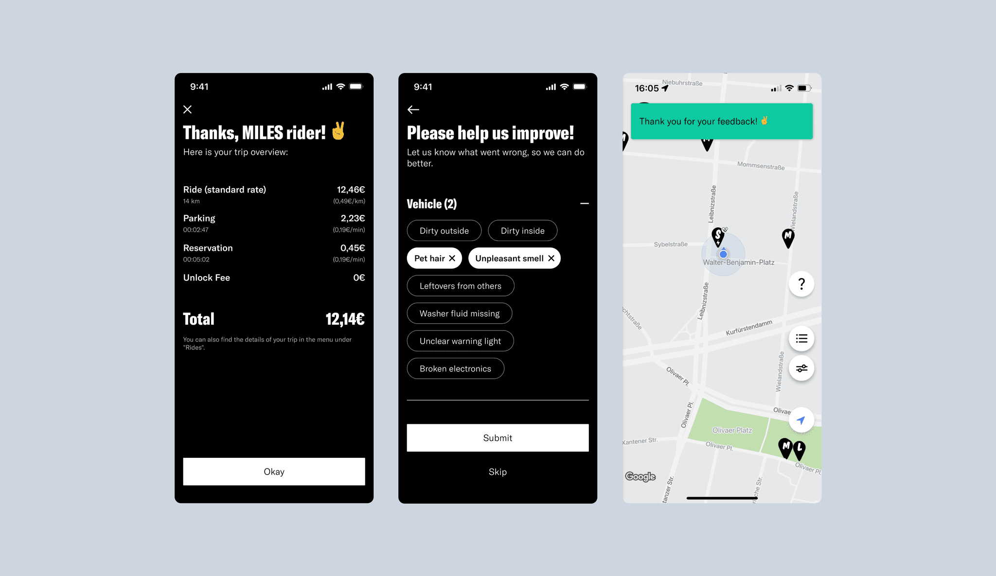
The task of improving the end-ride rating flow for the MILES app was focused on enhancing the quality and usefulness of user feedback. The original design primarily captured low ratings (three stars or less) and offered limited feedback options, which restricted the volume of actionable insights. The key issues were that feedback options didn't align with real customer complaints, the design was inconsistent, and the content structure was confusing. The goal was to redesign the feedback flow to be more intuitive, engaging, and reflective of actual user experiences.
To develop a more effective solution, a thorough competitive analysis was conducted. This research examined how other car-sharing platforms, car rental services, and booking sites handled feedback mechanisms. Insights from this analysis underscored the need for a structured, user-friendly approach that encouraged customers to share their experiences in greater detail.
Key improvements made:
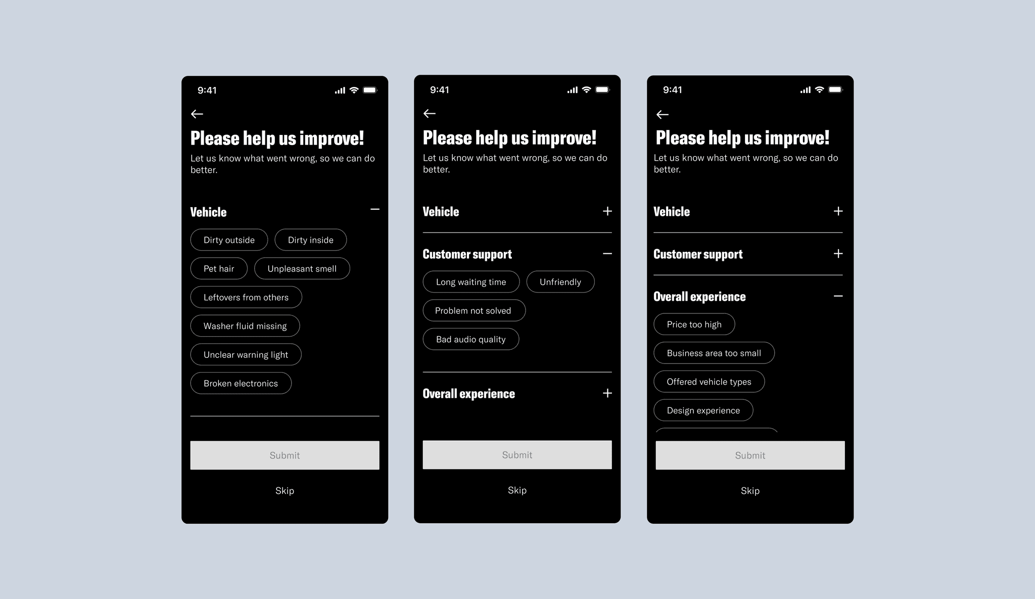
User-Centric Feedback Options: The feedback categories were revised to reflect common user concerns. Specific complaint options were introduced, allowing users to quickly select the most relevant feedback, leading to more accurate and actionable data.
Consistent Visual Design: The entire rating flow was redesigned with consistent typography, colors, and icons, improving readability and delivering a more professional and cohesive user experience.
Logical Content Structure: The feedback options were organized into expandable sections, reducing clutter and making it easier for users to navigate and provide more detailed feedback without feeling overwhelmed.
Engaging and Dynamic Interaction: Emojis were introduced to allow users to express their feelings visually, making the process more interactive. Smooth animations were also added to enhance the flow, making it feel quicker and more engaging, which helped increase user participation.
By aligning the feedback options with real customer concerns, enhancing visual consistency, and organizing content more logically, the updated end-ride rating flow significantly improved both the quantity and quality of user feedback. These enhancements boosted user engagement and provided MILES with more actionable insights to continuously improve their service, ultimately increasing overall customer satisfaction.
09
Website Update
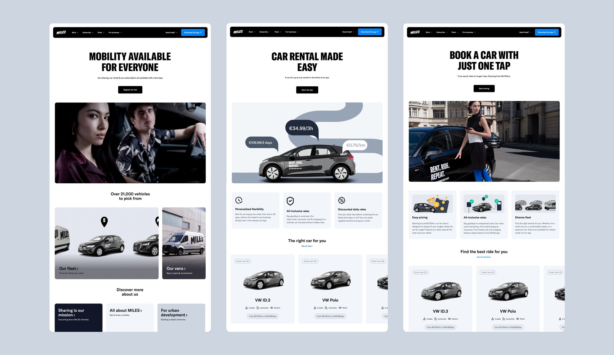
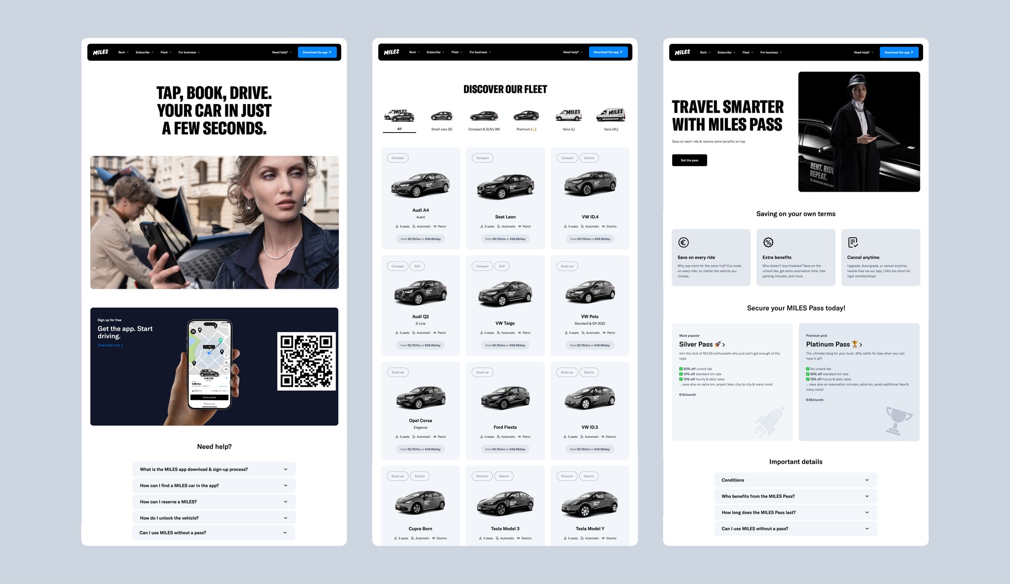
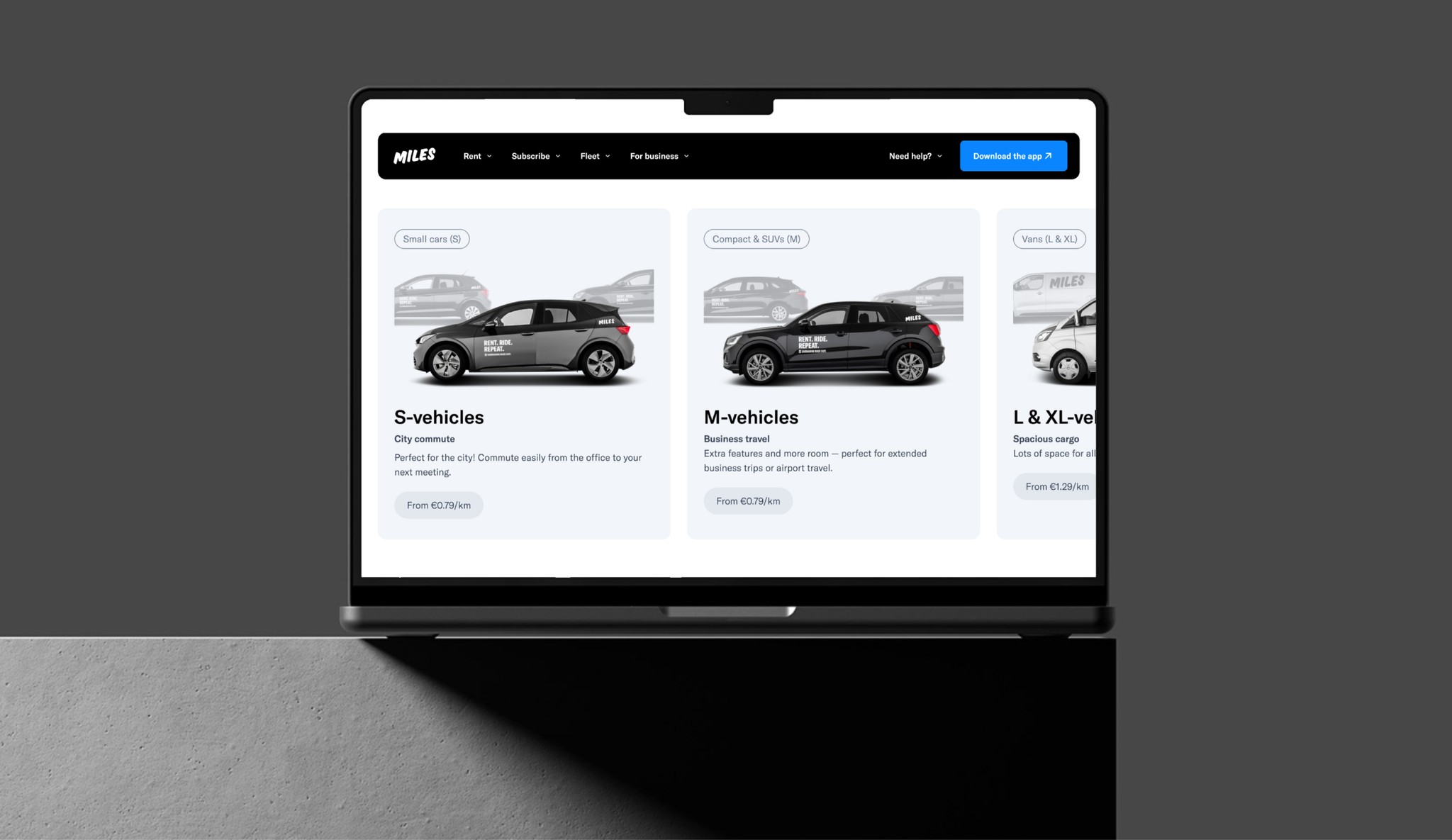
The comprehensive update to the MILES Mobility website was a strategic initiative aimed at aligning the digital platform with the company’s evolving service offerings and enhancing overall user experience. With significant changes to both the visual design and the site’s structural foundation, the project focused on creating a more streamlined, user-friendly interface that could effectively support the growing range of services offered by MILES, including car rental and car subscription.
Leveraging a newly established design system, the website's visual design was completely overhauled. This update introduced a modern, cohesive look that not only aligned with MILES' brand identity but also ensured consistency across all digital touchpoints. The new design emphasized clarity and minimalism, reducing visual clutter and making it easier for users to navigate the site.
The website's structure and navigation were also reinvented to better serve user needs. A new, more intuitive layout was implemented, which simplified the user journey and made essential information and features more accessible. The overall design was reduced and refined, focusing on what matters most to users, thereby enhancing the usability of the site.
One of the key enhancements was the integration of MILES' expanded service offerings. Although car rental and car subscription services are currently managed through separate platforms, these products were introduced on the main MILES website with the future goal of full integration. This approach ensures that users are aware of all available services and can easily navigate between them, even if final bookings or transactions are completed on other platforms.
In summary, the website update at MILES Mobility was a pivotal step in creating a more user-centric and visually cohesive digital experience. By reworking the site’s design, structure, and content, the project not only improved usability and user satisfaction but also laid the groundwork for future service integration, ensuring that the website can grow alongside MILES' expanding service offerings.
10
Challenges and Solutions
Creating a Consistent User Experience Across Platforms: MILES Mobility faced the challenge of delivering a seamless and unified user experience across its iOS app, web platform, and integrated products. Inconsistencies in design and navigation led to user confusion and a fragmented brand experience. To tackle this, a comprehensive design system was implemented, ensuring visual coherence and consistent interaction patterns across all digital touchpoints. This approach aligned the user experience with MILES' brand identity, providing a uniform look and feel that resonated with users, regardless of the platform they used.
Simplifying Complex User Processes: The original user processes, including registration and rate selection, were overly complicated, leading to high drop-off rates and user frustration. The solution involved streamlining these workflows, reducing the number of steps required to complete tasks, and introducing clearer navigation paths. For instance, the registration process was restructured to minimize friction, allowing users to sign up quickly with fewer steps, while the rate picker was redesigned to present pricing options more transparently, thereby improving user satisfaction and increasing conversions.
Expanding and Enhancing Feedback Mechanisms: The feedback system was focused on capturing input only at the end of rides, primarily from users who rated their experience poorly. To improve the quality and quantity of feedback, the system was redesigned to be more engaging. Interactive elements like emojis were introduced, creating a stronger emotional connection with users and encouraging them to share their experiences more openly. Animated transitions and intuitive navigation were added to make the process feel smoother and more responsive, ultimately leading to richer and more actionable insights, even within the same end-of-ride feedback framework.
Scalable Design Solutions for a Growing Service Offering: As MILES Mobility expanded its fleet and introduced new services, the existing design framework struggled to accommodate these changes, resulting in a disjointed user experience. The solution was to develop a scalable and flexible design system that could seamlessly integrate new vehicle types and services without compromising usability. This approach ensured that as MILES continued to grow, the user interface remained intuitive and cohesive, providing a consistent experience regardless of the service or vehicle selected.
Improving Transparency in Pricing and Services: Users often found the pricing and service information confusing, with unclear details about costs, rate options, and what would happen if they exceeded predefined limits. To address this, the rate picker and pricing overview were overhauled to provide detailed, transparent information. This included a clear breakdown of rate prices, additional costs, and what was included in each rate, helping users make informed decisions. The introduction of a new trip planning feature further enhanced this transparency, allowing users to plan and track their expenses effortlessly.
11
Result
The comprehensive redesign and optimization efforts at MILES Mobility led to significant improvements across multiple dimensions:
Increased User Engagement: With the introduction of a more consistent and user-friendly design system, there was a 20% increase in user engagement across MILES' digital platforms.
Higher Conversion Rates: The streamlined registration process and transparent pricing information contributed to a noticeable uptick in conversion rates, with more users completing sign-ups and pre-selecting rates for their rides.
Improved User Satisfaction: Feedback from usability testing and surveys indicated a marked improvement in overall user satisfaction. Users appreciated the enhanced visual design, clearer navigation, and more transparent service information.
Scalable Design Infrastructure: The new design system provided a robust foundation for future growth, enabling MILES Mobility to introduce new features and services without compromising the user experience.
Decreased Customer Support Tickets: The clearer, more transparent pricing and service information led to a reduction in customer support inquiries, particularly around rate selection and billing issues.



Let's create something great together.
dariradevich@gmail.com
